Artistic LInear Relationships
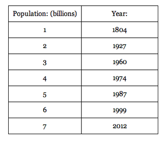
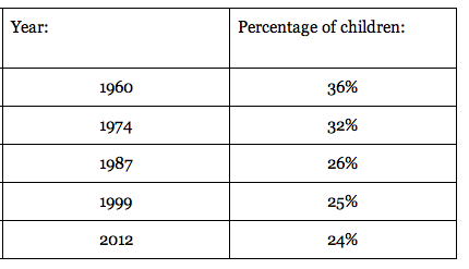
Recently in Math class we completed a project about linear and non linear relationships. We chose real world relationships, collected data, then determined if it was linear (or approximately linear) or non linear. The purpose of this project was to understand the variety of relations in the world. There are transformations everywhere in our world. We could study any function we desired. I chose to research the world's population. The first relationship I looked at was the world's populations, in billions, to the year. The second relationship I looked at was the year to the percentage of children. I chose to research population because recently there has been a lot of media, movies, and shows about our planet being overpopulated by humans. I wanted to study how the human race reached 7 billion and how long it took us to get here. It was a challenge obtaining the information I needed. There were many websites that had information but the information was different on each site. There were numerous answers and because there was so many I found a reliable website ( http://www.worldpopulationstatistics.com/population-rankings/world-population-by-year/ ) then I cross checked the data with three other websites. I disregarded the population predictions and focused on previous years. Along with studying linear and non linear functions, we learned about In and Out tables and used them when collecting our data. These are the two In and Out tables I created with my data.
|
|
It is very easy to transfer the data from an In and Out table to a graph. The column to the left represents the x coordinate and the column to the right represents the y coordinate. This is the graph of the first relationship, population to the year.
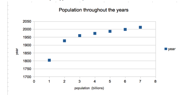
When you first look at the graph it appears to be non linear but actually when you study it, you learn it is approximately linear. The first point is an outlier which means it is random and does not fit with the trend of the data therefore we can ignore it. All the points on the line appear to create a somewhat straight line, it is not exactly straight however. We can determine if the line in approximately linear by finding the slope of each individual line between two points. To find the slope of two points you have to find the change in y divided by the change in x. The formula used to find slope is y 2 - y 1 divided by x 2 - x 1 .Using that formula I was able to find the slope of all the points. The slope of points 2 and 3 is 33. The slope of points 3 and 4 is 14. The slope of points 4 and 5 is 13. The slope of points 5 and 6 is 12. Lastly, the slope of points 6 and 7 is 13. The slopes are fairly consist confirming it is approximately linear. However, the second graph it very different.
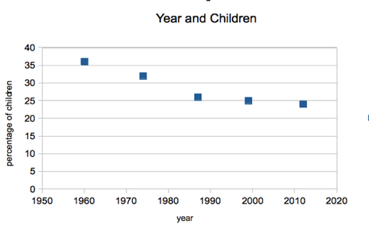
At a first glance, the points appear to have some kind of relationship. Using the same technique as before we are able to gain a deeper understand of the relationship. The slope of points 1 and 2 is -2/7. The slope of points 2 and 3 is -6/13. The slope of points 3 and 4 is -1/12. Lastly, the slope of points 4 and 5 is -1/13. The slopes have a very wide variety and do not match up in any way. At one point there was the same increase in x but a completely different decrease in y. This confirms that the function is non linear.
Once we gathered our data and made the In and Out tables and graphs we used our creativity and found an original way to display the data using art. I chose to create a map of the world using neon colors. Where land was, I sponged on 5 different vibrant colors. Sponging gave the paint a unique texture that I really liked. Where water was, I painted black because I was focusing on world population and there is no people living in the bottom of the ocean so it is irrelevant. I wanted to create great contrast between the land and water so the land would pop out at the viewer. We did not have to represent the graph in our art piece but I chose to. I put a large piece of butcher paper over the canvas and using a ruler I redrew the graph. Where the points were I poked holes through the canvas and put a little LCD light. When all the points were completed and the lights were turned on it created the original graph of population to the year. This is the final art piece.
Once we gathered our data and made the In and Out tables and graphs we used our creativity and found an original way to display the data using art. I chose to create a map of the world using neon colors. Where land was, I sponged on 5 different vibrant colors. Sponging gave the paint a unique texture that I really liked. Where water was, I painted black because I was focusing on world population and there is no people living in the bottom of the ocean so it is irrelevant. I wanted to create great contrast between the land and water so the land would pop out at the viewer. We did not have to represent the graph in our art piece but I chose to. I put a large piece of butcher paper over the canvas and using a ruler I redrew the graph. Where the points were I poked holes through the canvas and put a little LCD light. When all the points were completed and the lights were turned on it created the original graph of population to the year. This is the final art piece.
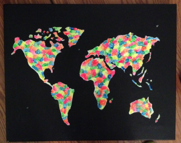
painting with the lights off
|
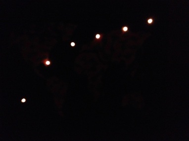
light graph turned on
|
This project was pretty interesting. I liked how deep we went into the content of linear and non linear functions. I thought the time was very well balanced between learning the content and creating and building. One thing that I didn't like about this project is we didn't do any rough drafts before our final art piece. I would have liked to plan out and do a sketch of what the art piece would look like rather than talking about it. I used describe and articulate the most out of all the habits of a mathematician. We spent a lot of time discussing pattern and relationships. I did a good job phrasing and organizing my ideas and thoughts so everyone could understand them . In the past I have struggled expressing my opinions but I excelled in this project. I think if I used collaborate and listen more often through out the corse of this project I would have been able to see more patterns because my peers could see something I couldn't. Sometimes I got stuck when looking at a function but my peers knew the rule and I should have asked for help but I didn't. Other than that I feel this project went very smoothly. I wouldn't really change anything for the students next year. Overall this project was very intriguing and I learned an abundance of new information about transformations. In the end I created an art piece that I was very proud of and gained a lot of knowledge. This project was a huge success!
